UI/UX DESIGN | RESEARCH
ECOWOMANIST INSTITUTE X SCADPRO
Role: User Experience, Visual Design, Project Management
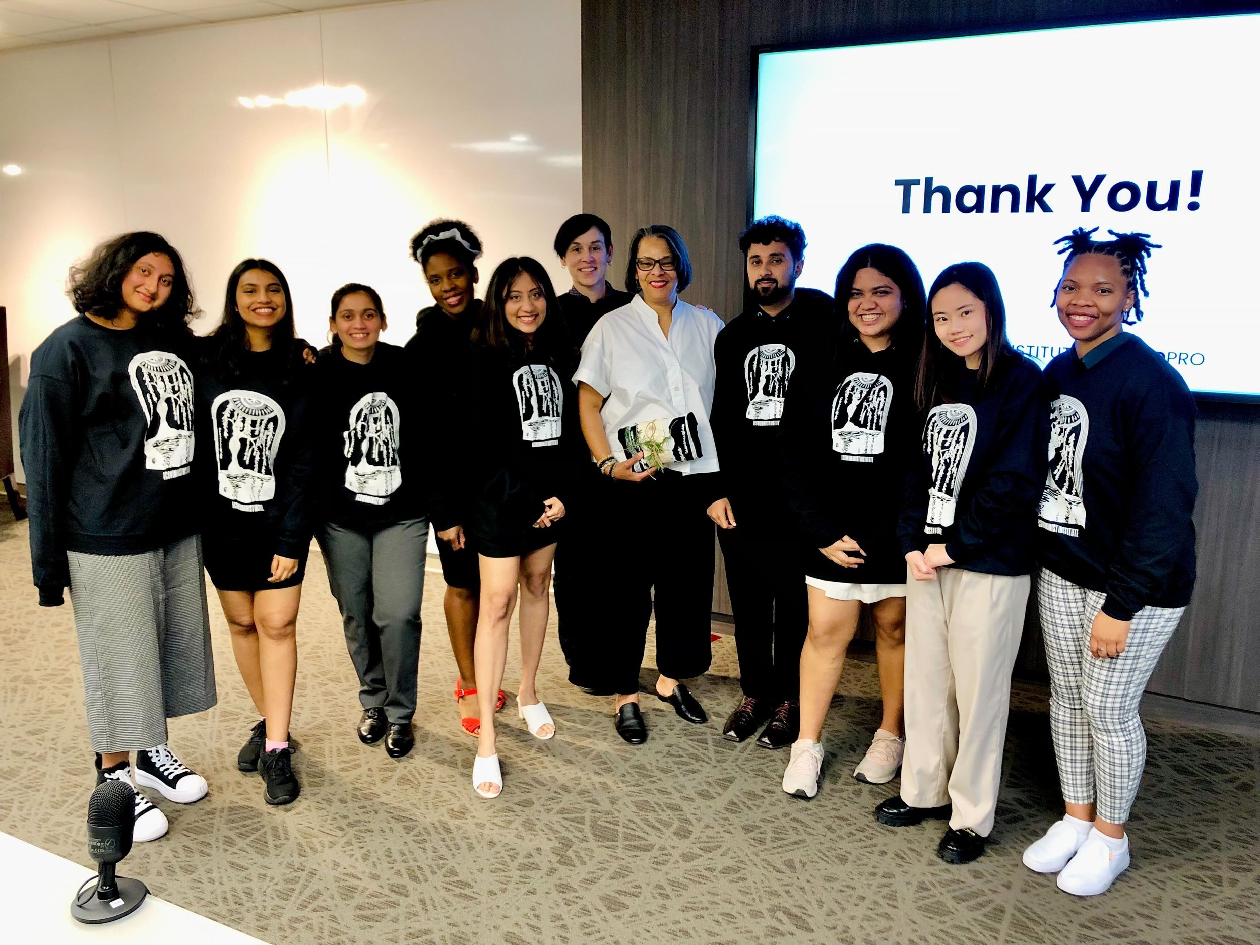
This project was a collaboration between Ecowomanist Institute and the students of SCAD (team of nine). Ecowomanist Institute recognized the need to enhance their brand's presence on social media, improve their tone of voice, and redesign their website to reach a wider audience and foster greater community involvement.
To have a look at our final website - https://www.ewiscadpro.org
To have a look at our process of building this project -
https://employeepages.scad.edu/~hquarzo/ewi-scadpro-process/Homepage-ut.html
Event
SCADPRO X EcoWomanist Institute
Timeframe
10 weeks
Team
Bhavyata Shah, Tianshu Kuai, Gena Dell,
Bhavani Sitaraman, Prajakta Petkar,
Devika Kundu, Sayee Ambekar, Harkaran Randhawa, Tanisha Rule
Professor
Holly Quarzo
Tools
Figma
FigJam
Adobe
Canva
Bootstrap
Dreamweaver
Deliverables
WIX Website
Social Media Design
Language style guide
Merch Design
Process Website
The Ask
The Best Team was tasked with helping EWI better engage a global audience, educate more people on eco-womanism, and create a welcoming, safe space for the EWI community.
Problem Statement
EWI seeks to bring more awareness to the organization by creating a future-proof design system to help them reach and communicate with a global audience.
The Objective
Create a cohesive, internally maintained website, content, and social media design system that expands EWI’s reach while encouraging engagement and facilitating a community of safe spaces for Black women and women of color to express themselves.
Moodboard
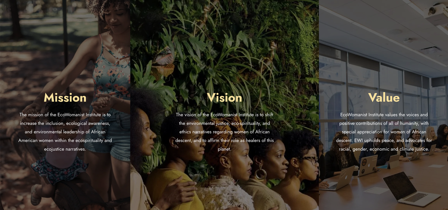
We used expressive images associated with nature and calm to provide the feel for our mood board. The visuals capture a spirit of togetherness and community. We also showed representation of EWI’s audience. The tone is inviting, welcoming, and promotes healing.
Style Tile
Our style tile included all the webpage elements that seem to just happen. But lots of thought and trial go into selecting the perfect header sizes, colors, imagery, and page characteristics that give that effortless look. We chose creams, browns, and greens, with pops of yellow suggesting hope and the kind of nurturing we only get from the sun…from nature.
Proposed Sitemap
We wanted a revamped sitemap that would guide visitors through all EWI had to offer. That meant not only creating cohesive standard navigation but making suggestions through intuitive calls to action
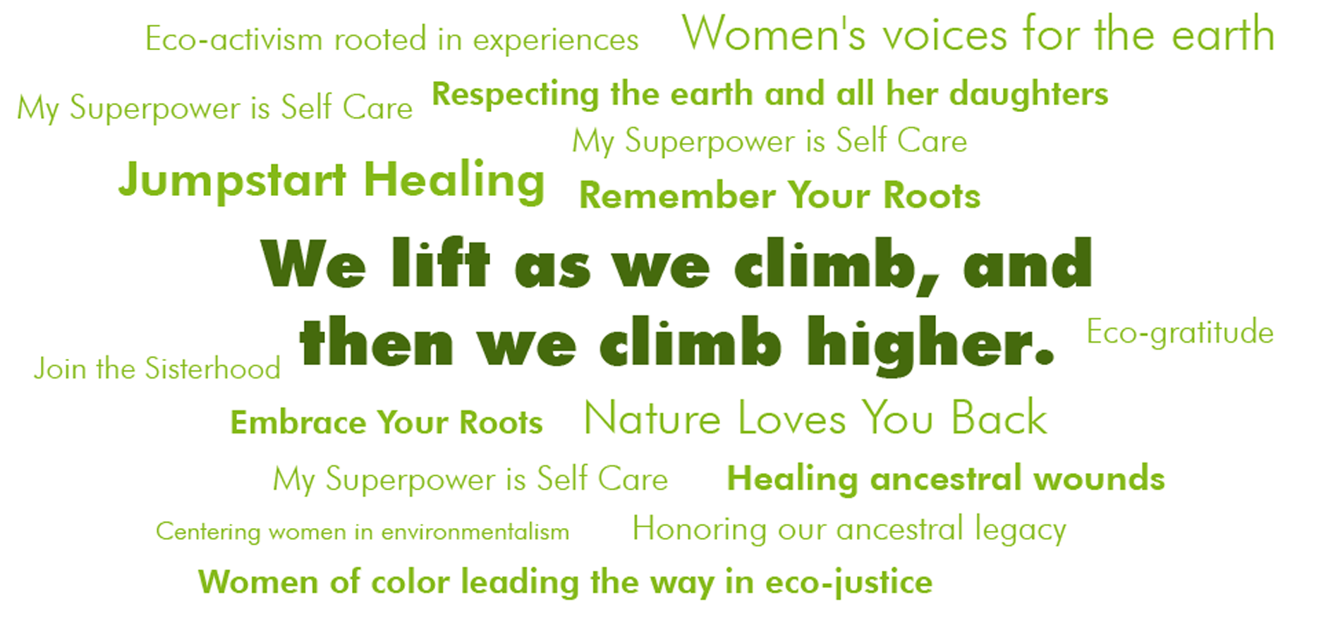
Proposed Language Approach and Hashtags

To have a look at our final website - https://www.ewiscadpro.org
To have a look at our process of building this project -
https://employeepages.scad.edu/~hquarzo/ewi-scadpro-process/Homepage-ut.html


